ShopDreamUp AI ArtDreamUp
Deviation Actions


Suggested Deviants


Suggested Collections


You Might Like…


Featured in Groups


Description
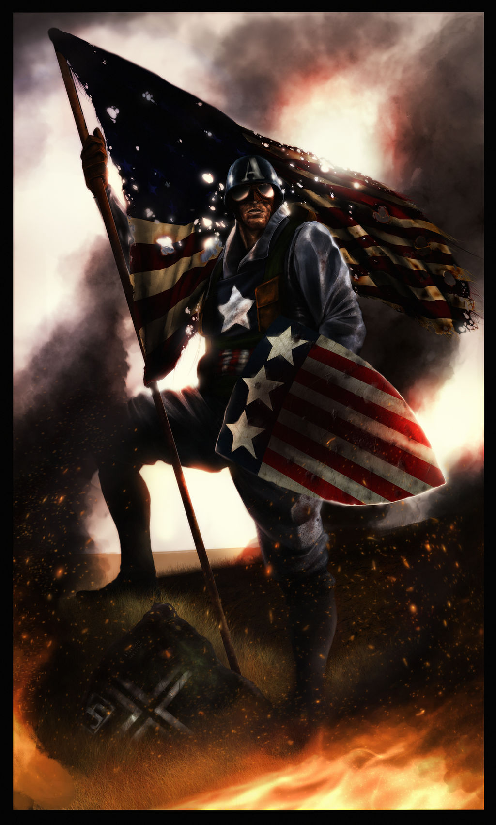
My rendition of WW2 captain america.
I see him more as "Joe the plumber" superhero right now, more unknown and just a regular lookin' guy other then the fact that hes a super soldier.
Let me know what everyone thinks.
CS3
Wack-um tablet
I see him more as "Joe the plumber" superhero right now, more unknown and just a regular lookin' guy other then the fact that hes a super soldier.
Let me know what everyone thinks.
CS3
Wack-um tablet
Image size
4500x7478px 50.17 MB
© 2009 - 2024 SharpWriter
Comments68
Join the community to add your comment. Already a deviant? Log In
Incredible